Onwards: the fifth major iteration
Nearly four years ago was when I introduced the last big redesign of my website. Although I changed the background a few months after, the design has stayed more or less the same throughout the years, until I went on a big trip in 2012.
Surprisingly, I was actually fairly satisfied with how information on my website was laid out — I just really didn't like the –in retrospect– rather overly convoluted design that I'd painted it with.
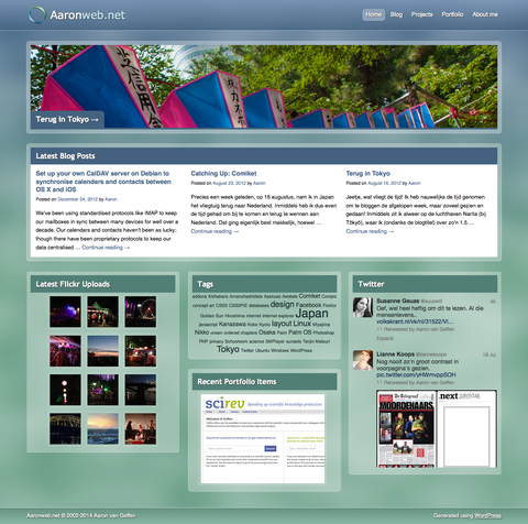
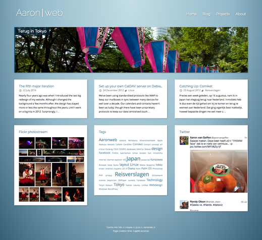
So, back to the drawing board, right? And so I did, on the 23rd of July 2013 — exactly a year ago. Inspired by minimalist design that is fairly prevalent these days, I had actually made a more or less finished design within a month. Compare the home pages between the last two designs below:
The home page had already had a big overhaul back in 2012 and, as mentioned earlier, it was quite to the point, which I rather like, still. Unsurprisingly, I retained the same basic lay-out in the new design — I just dropped everything else and started from scratch. The result is an obviously much cleaner homepage.
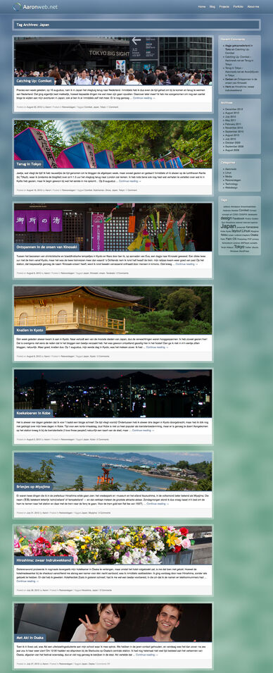
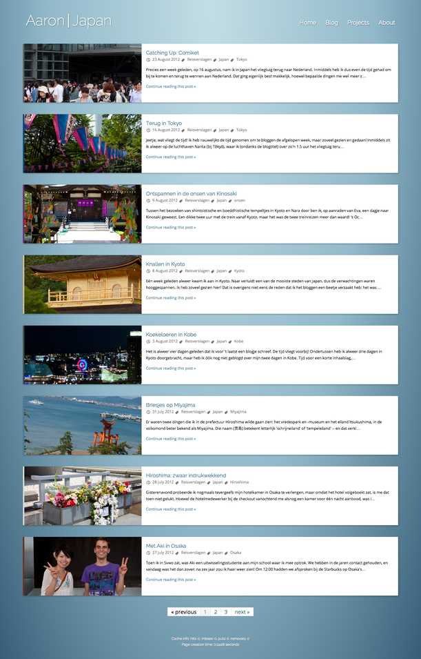
Other areas of the site got a much more drastic overhaul, however. Let's look at the blog index, for example:
The old design on the left is much more cluttered, while the one on the right shows the same information. How on Earth could I design an atrocity like the one on the left? Well, the explanation is as straightforward as the oneliner responsible for it, really: the photo headers were merely included as an afterthought. Only in 2012, two years after I designed the original lay-out, did I start to include photos as headers. Obviously, these were taken into account in the new design from the very beginning.
Of course, all this begs the question: why did it take me a year to update my site? Time constraints and other personal circumstances aside, I also really wanted to do away with WordPress. While it's extremely user-friendly on the front-end, it is an absolute mess under the hood. Ironically, their motto is "Code is poetry" — well, as I've said before on Twitter, theirs must be somewhere on the level of Vogons, then.
So, when I finally had some more time, I ended up writing my own CMS, again. Not repressing the slightest bit of perfectionism, this obviously took more time than I'd initally hoped. The end result is most satisfying, however.
You just can't post comments here quite yet — which, admittedly, is a bit unfortunate! Please do let me know what you think, though. You know how to reach me.


Comments closed
This blog post has been archived; it is currently not possible to comment.