De Uilenvleugel v3
Like many my age, during my teenage years I was a big fan of the Harry Potter books. Teenage me decided the best way of outing this enthusiasm was to make a website dedicated to niches in the fandom, so on I went: together with friends I met on another forum De Uilenvleugel became a reality.
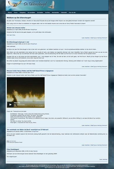
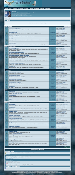
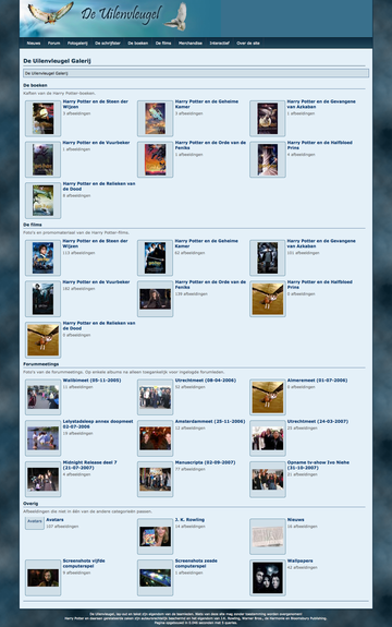
This post covers the third and last version of the lay-out. For this lay-out, we went back to the drawing board: what colours were ones we associated with the books? Eventually, we ended up settling somewhere between the first and second lay-out, with blue and green hues. On the top right we opted to show banners -- this space is left empty in the screenshots below.
On the left is the home page, which showed the latest news we deemed relevant to the fandom. Next to it is the forum lay-out, which was most central to the site. On the right is the gallery, which was more of a side project.


