De Uilenvleugel v2
Like many my age, during my teenage years I was a big fan of the Harry Potter books. Teenage me decided the best way of outing this enthusiasm was to make a website dedicated to niches in the fandom, so on I went: together with friends I met on another forum De Uilenvleugel became a reality.
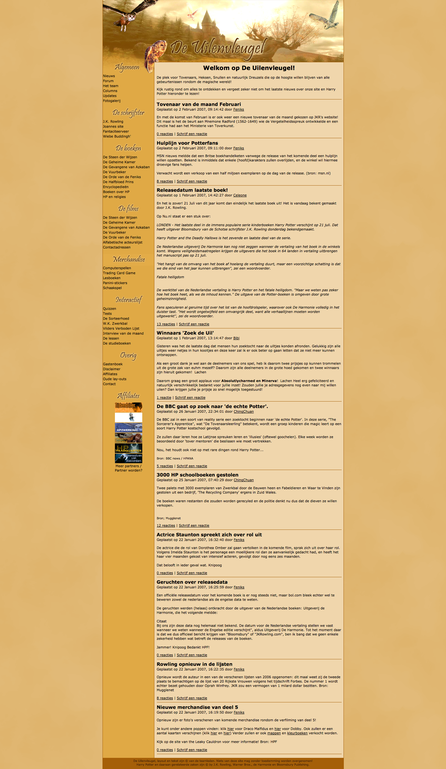
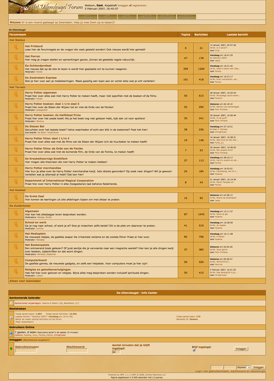
This post covers the second version of the lay-out. We switched from the classic, blue hues to warm, homely earth colours, which greatly improved the website overall, increasing the bond we had with the theme ('De Uilenvleugel' is the Dutch translation for 'the Owlery').
On the left is the home page, which showed the latest news we deemed relevant to the fandom. Next to it is the forum lay-out, which was most central to the site.

