Autumn is Here
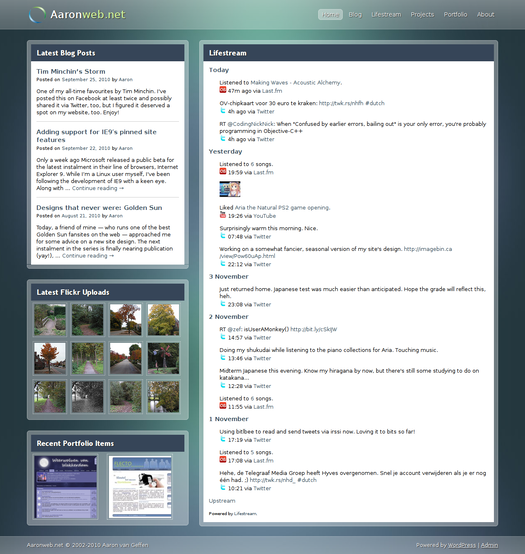
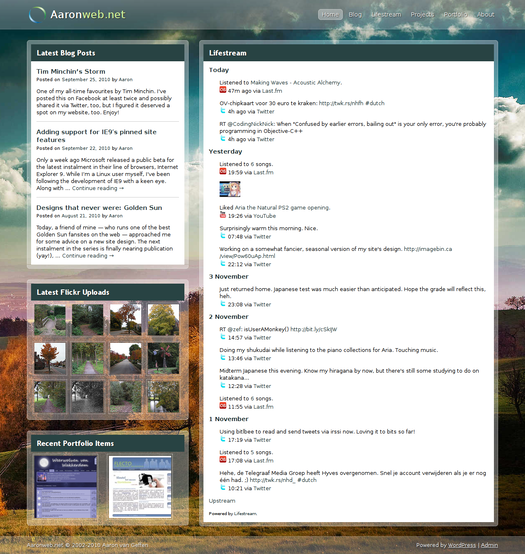
Seeing all the trees turning into beautiful new colours, I decided to give my site a little seasonal facelift, too. After a few attempts, I stumbled upon this wallpaper on InterfaceLIFT and knew I had found the right image for the job. After contacting the artist, I could get to work.
The process of transforming my layout was actually fairly simple, thanks to the amount of transparency it uses. The only things I needed to get done, were the obvious change of background image as well as recompressing it (the original image was a whopping 4.5 MB of high-definition glory, the on my site 411 kB) and a slight change of colours for the content headers. :)
For the curious few amongst you who like doing comparisons:
Any comments are, as usual, much appreciated!
PS: yes, I know my portfolio page is terribly outdated. :( I hope I'll be able to add the newer stuff soon.


Comments
Prachtig!
Layout looks awesome! :D
is mooi hoor! :)
Comments closed
This blog post has been archived; it is currently not possible to comment.