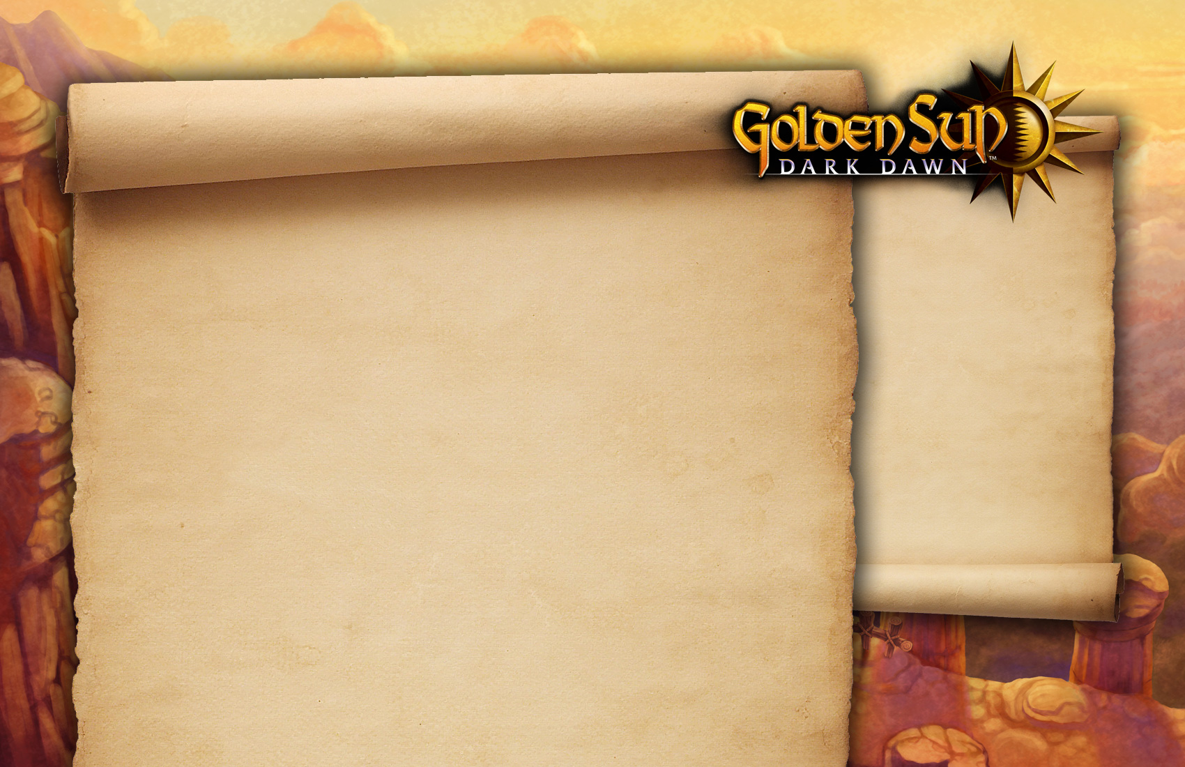
Designs that never were: Golden Sun
Today, a friend of mine — who runs one of the best Golden Sun fansites on the web — approached me for some advice on a new site design. The next instalment in the series is finally nearing publication (yay!), having finally been announced six years after the last game, so she's all set on updating her site.
While the design she had been working on thus far didn't look bad at all, the official Japanese website opened up a few days ago, so we were wondering whether we could do something with the high-res official art that had been released.
After some brainstorming, I opted to just do a quick mockup to see where it'd lead. While she ended up not using the design, I thought I'd post it here — if only to show I haven't died after spending hours on cleaning my music library (as tweeted about earlier this week). ;)

Ingredients for this design:
- Some of the official artwork
- A high-res version of the official logo
- Stock imagery for the parchment
- Photoshop CS4, running in Wine
Having thoughts about this design you want to share? I'd love to hear them!
Comments closed
This blog post has been archived; it is currently not possible to comment.