New website, new beginnings
A few days ago I announced I was working on a new design for this website. After weeks of dilly-dallying, I finally applied the finishing touches today. The result of all this is on your desktop right now.
What an illuminating voyage has it been. This design has, without a doubt, been the most ambitious design I've ever wanted to make so far. Even though I had a general idea of what I wanted to make before even touching my tools, actually making it turned out to be quite a challenge, this time. Not only did I initially require lots of markup, I couldn't settle on a colour scheme, either.
Markup techniques
As you've probably noticed, the site is sliced into widgety areas, surrounded by semi-transparent rounded borders and separated by gaps. These transparent borders were the one of the very first things that came up when I started brainstorming about the design. Despite being slightly hard to realise, especially when combined with a background image, I ended up not wanting to settle for anything else, which almost became my downfall.
Now, looking at the initial HTML I wrote up, this design would've used quite a few nested divs to achieve the border effects. I really didn't like this, so I started looking for alternatives, which I found relatively quickly in the form of the CSS3 border-image property. This property allows me to draw the borders with but one image, which is sliced by the browser automatically. The initial show stopper for using this technique was the fact that current versions of Internet Explorer don't support CSS3 properties yet, in contrast to all major other browsers. Much to my relief, CSS3PIE was announced when I was in the progress of rewriting the markup, allowing me to use this technique in Internet Explorer as well!
The colour scheme
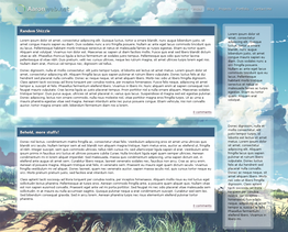
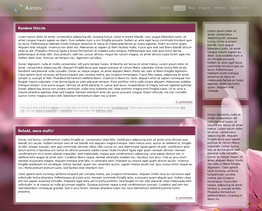
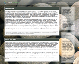
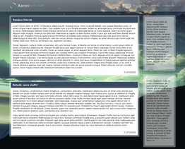
Finding the right colour scheme turned out to be rather problematic. I started out with the idea of using photos as the background, but finding a good photo — or any other image, for that matter — turned out to be very challenging. I can't possibly post all design attempts, but here are a few anyway:
Busy times
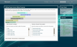
So, how long have I been working on this? To be honest, I can't say exactly. I started working on it around the end of April, but due to me being busy at university, I didn't have much time to work on it during May and June. I did, however, end up using the initial version of the design for a small university project. Let me throw in a screenshot while I'm at it:
WordPress
When I started planning out my new website, I opted to use WordPress as a CMS, too, instead of the home-made framework I had been using until then. Using WordPress means blogging everywhere, not just at places with SSH access, including on a smartphone. That, combined with the massive community behind it, really appealed to me.
You've probably noticed this isn't quite a vanilla WordPress installation. Amongst other plugins, I'm using the Lifestream plugin to generate the fancy feed on the frontpage and the WP Super Cache plugin to keep things running super fast.
Not all pages are served fully by WordPress yet, though. Due to time constraints (as well as me having had enough for a while ;)), I ended up writing a wrapper for my old project and portfolio pages, allowing them to use the WordPress template system without being proper WordPress pages yet. I may dedicate a post to this later.
In conclusion
It's been a long journey, but I'm quite happy with how the design turned out. I'm practically always looking for some feedback on my designs, so I'd really appreciate any comments with thoughts you might have. Thanks!
Comments
I really like this layout. Awesome!
You are amazing Aaron!
This layout is great ;)
Nice design, Aaron! I like it! :)
Yes i saw it en it is amazig what you have done. Very beautifull.
The new website looks awesome. Also great you're using Wordpress. =]
Anyway, thanks for mentioning CSS3PIE. This way I can finally just use CSS3 without worrying about IE compatibility.
Oh, and did I recognize the first and last design attempt from "5 centimeters per second"? (Haven't watched it yet, though...)
Thanks for the kind words. :)
<blockquote>Oh, and did I recognize the first and last design attempt from “5 centimeters per second”? (Haven’t watched it yet, though…)</blockquote>
Yep. It says so in the attachment description, too. ;)
It has turned out a beautiful site!
Comments closed
This blog post has been archived; it is currently not possible to comment.